Calm
olten-50 to olten-100
Default operational page background. Almost imperceptible.
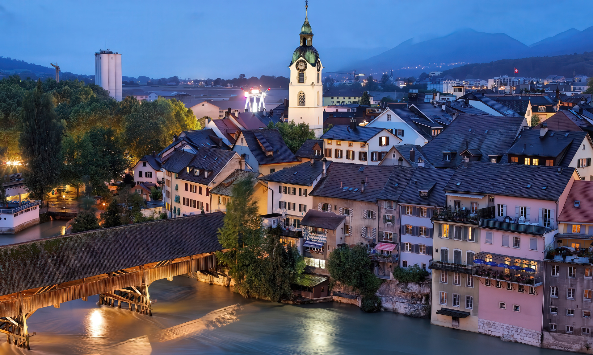
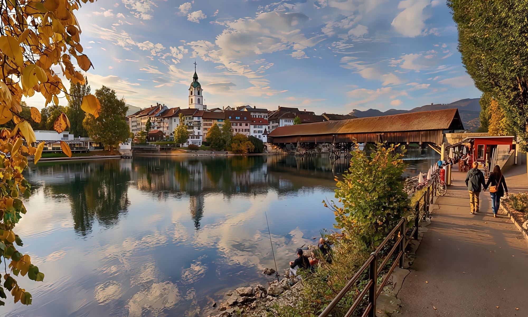
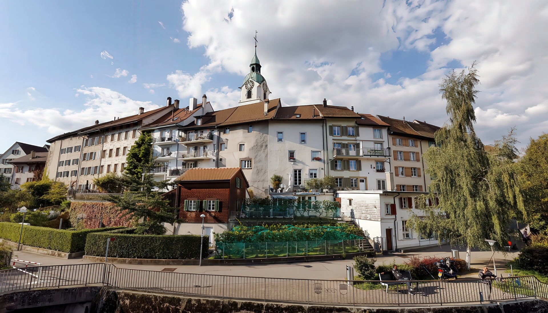
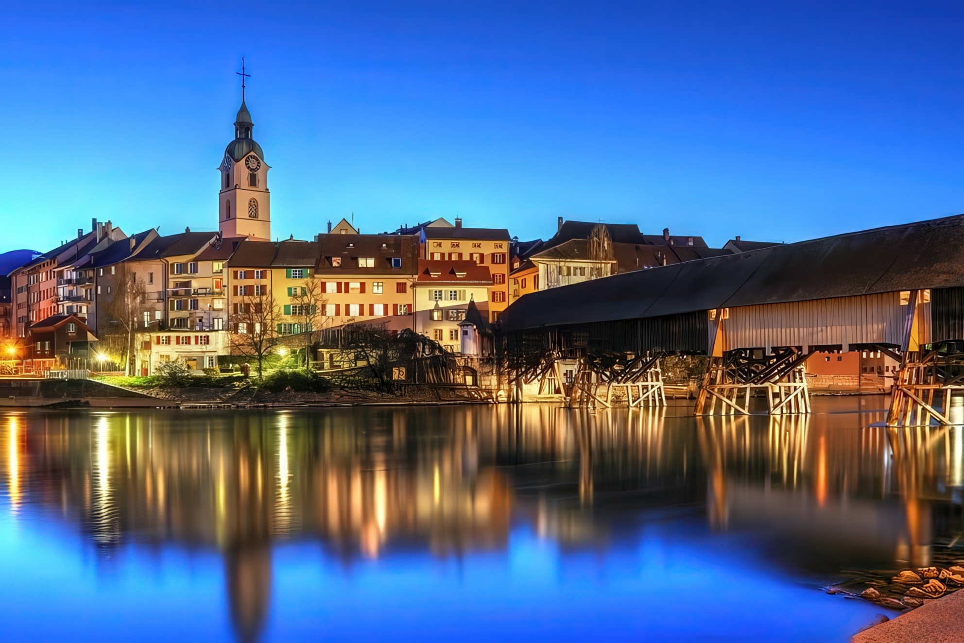
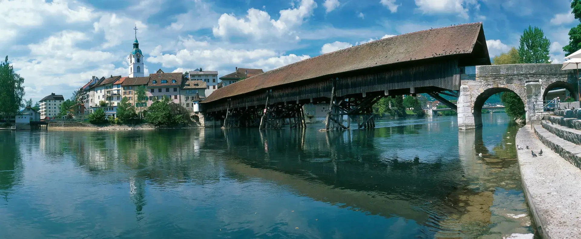
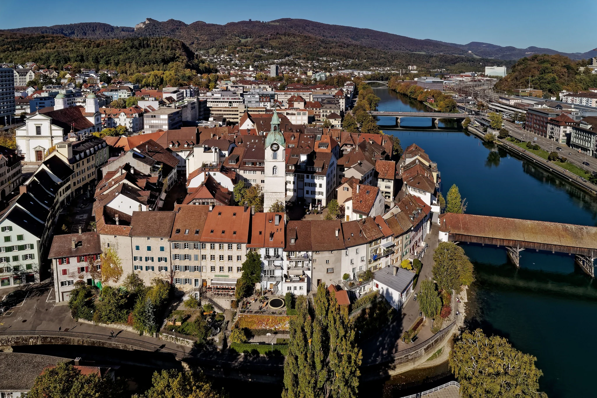
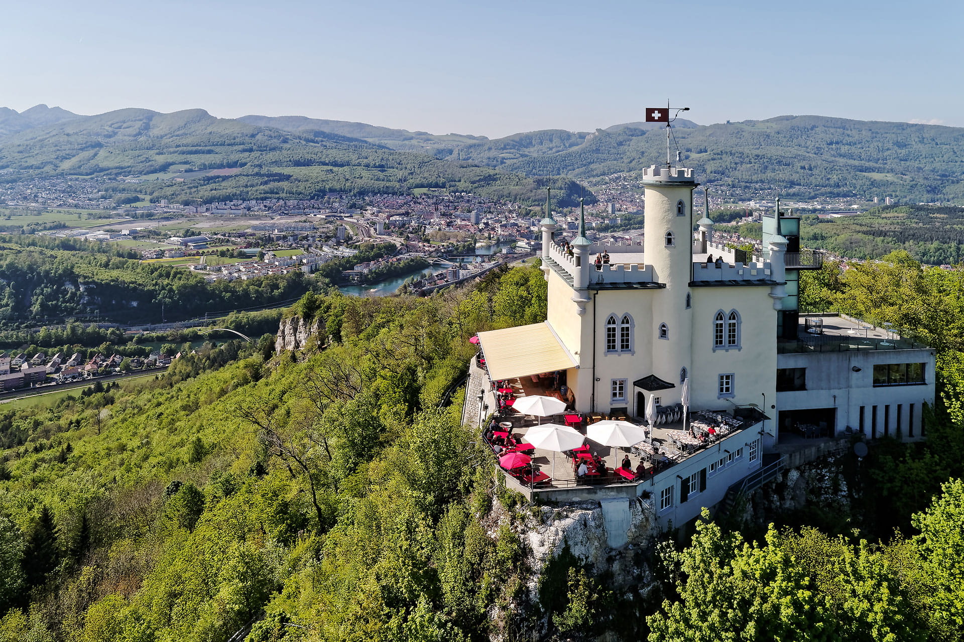
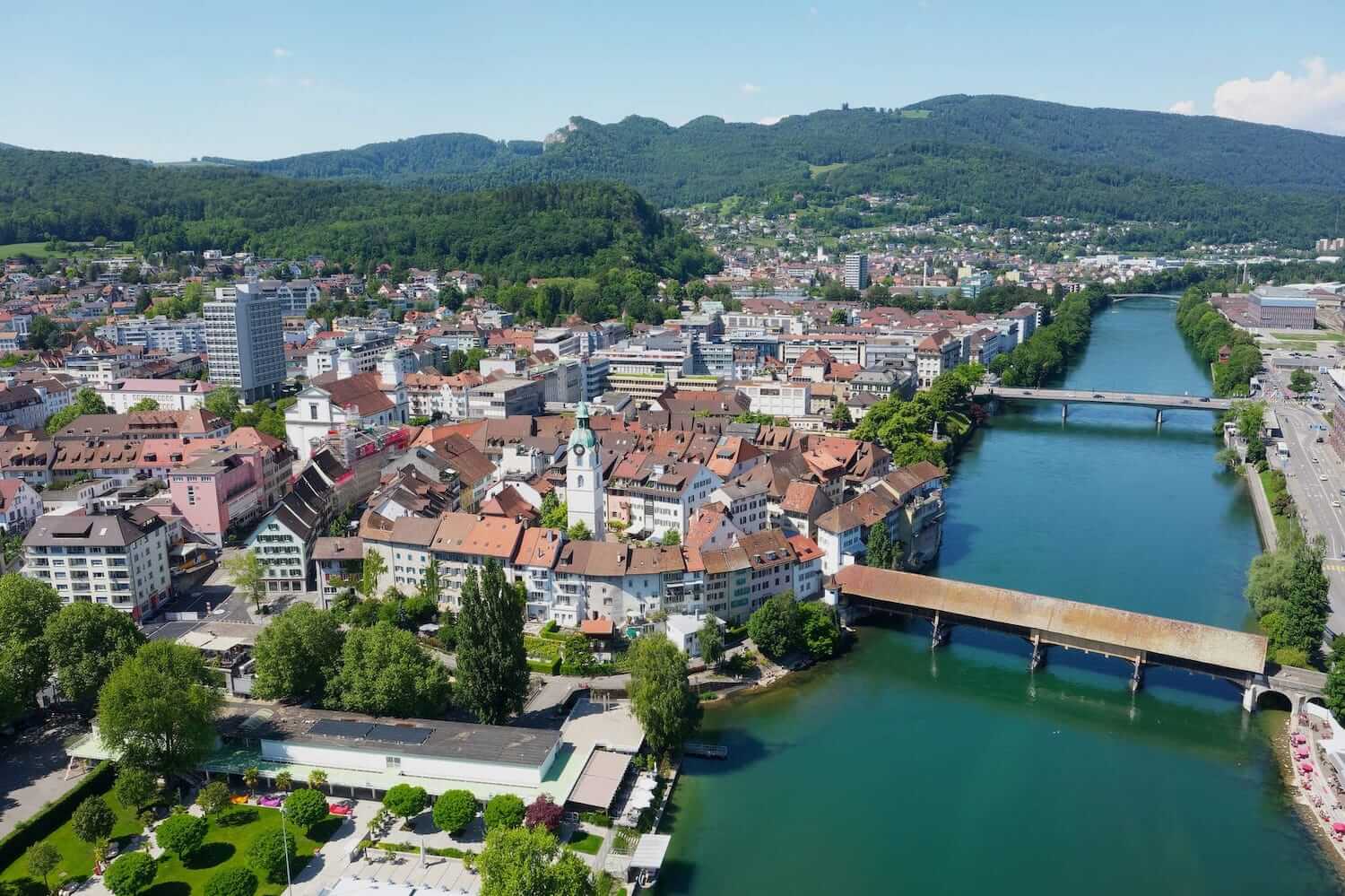
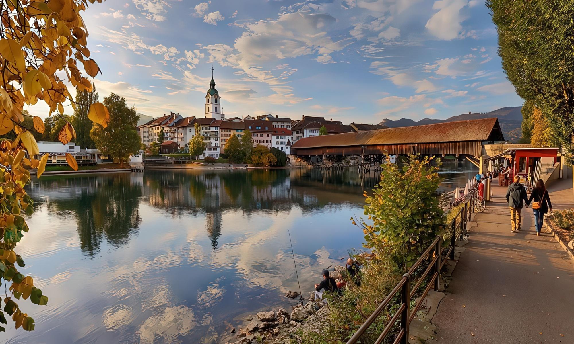
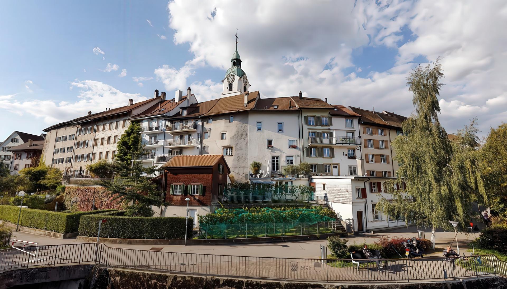
--gradient-civic-calmOlten sits where the Aare bends and the rails of four cantons cross.This is the living brand system for a small Swiss city with a national role: the visual language for everything we publish, build, and put on the street.

We are Olten. A city that flows between Jura and Mittelland, between platform and old town, between the quiet and the curious.
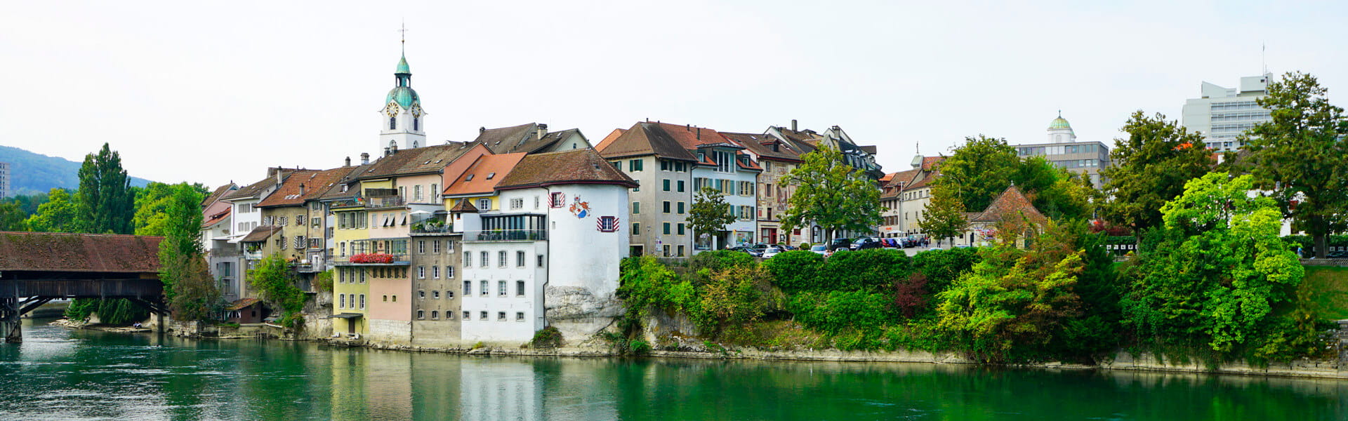
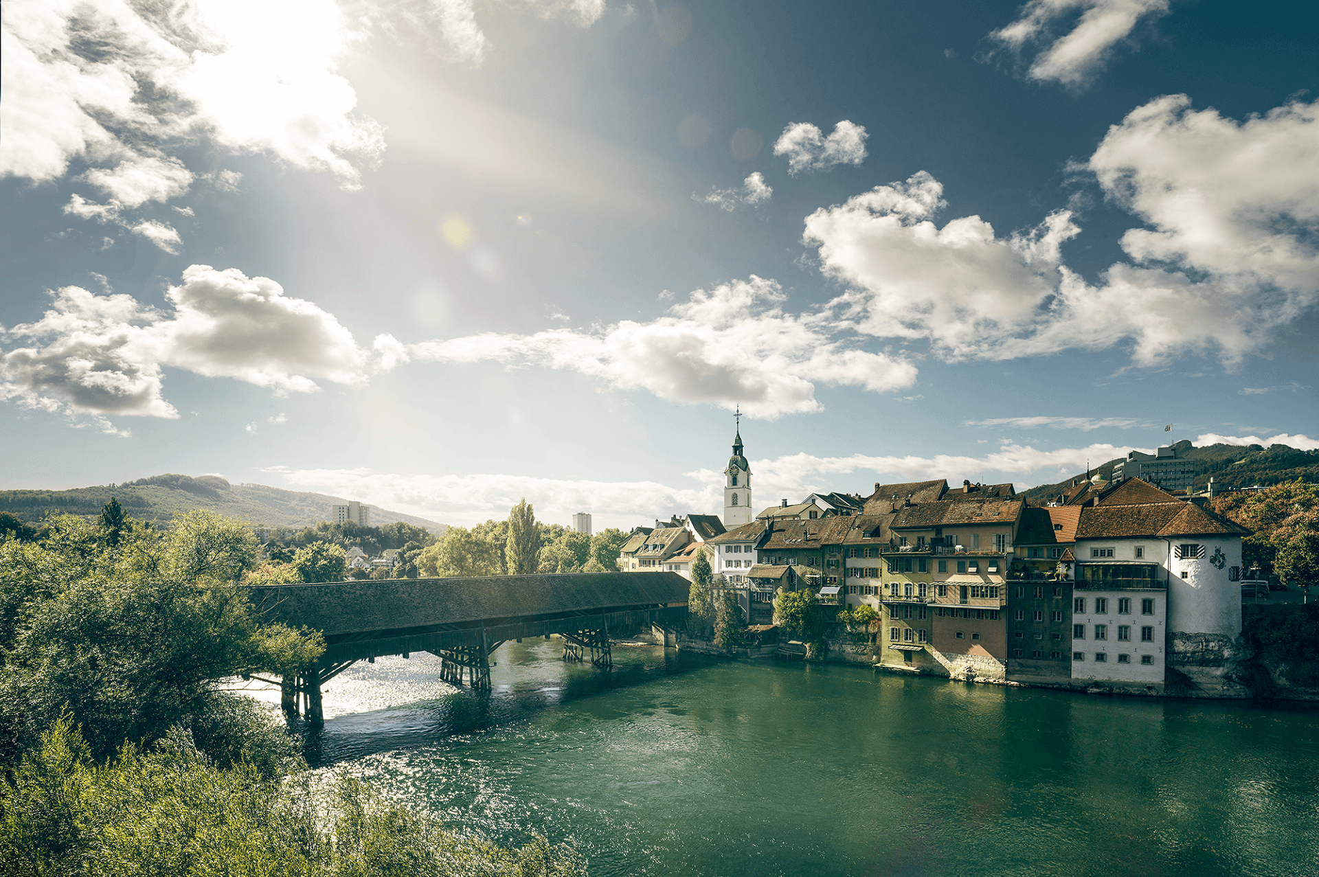
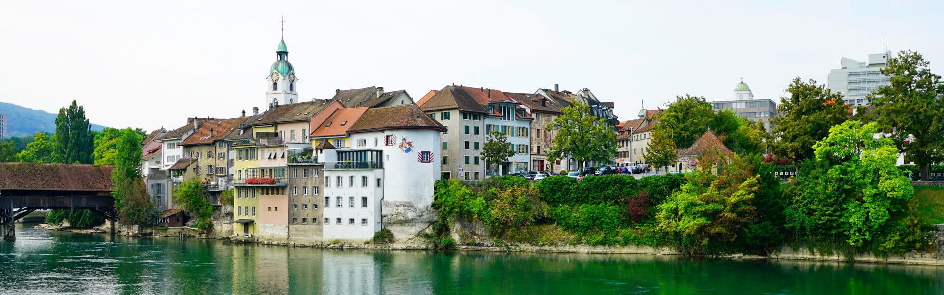
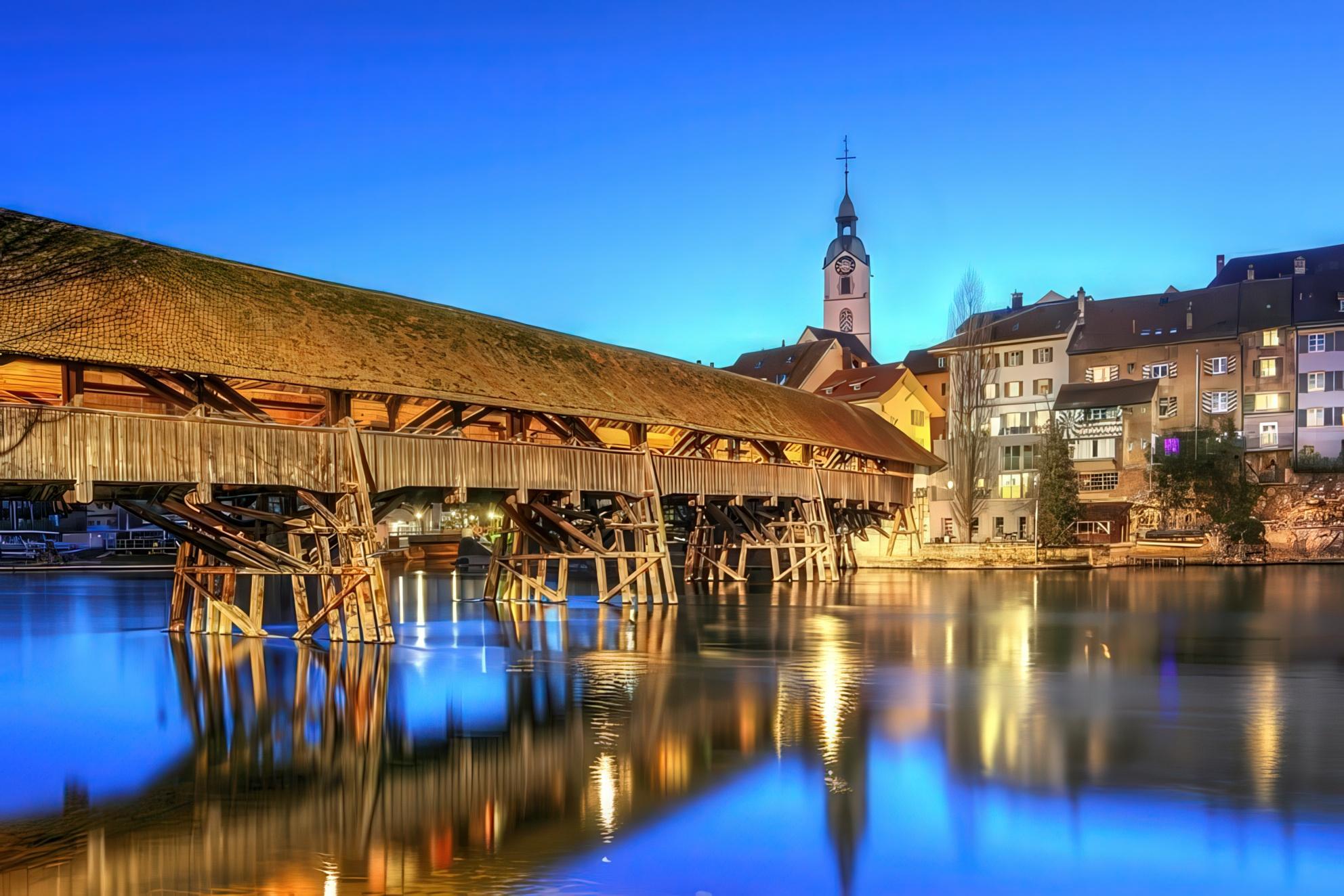
The Aare gives the city its rhythm. Three currents flow through Olten at once: water, rail, and the everyday crossing of people on the old wooden bridge.
Zurich, Basel, Bern and Lucerne are each thirty minutes away. Olten is not a destination. It is the room where Switzerland meets itself.
Nineteen thousand people. A theatre, an art museum, a writers' path. Small enough to know your neighbours. Big enough to keep surprising them.
Jura sandstone, iron bridges, Bauhaus typography. Things made well, made to last, made for the public.
Pick a surface and a variant to preview the Olten mark on every approved brand background. Below: misuse examples and clearspace rules to keep the mark legible everywhere it appears.
Tap a surface to preview the mark on it.
Minimum margin around the mark equals the height of the Oin “Olten”. Never crowd the river lines.
The Aare bends through Olten in three visible currents — the river itself, the rail corridor, and the everyday flow of people across the wooden bridge. The logo's three strokes are the city's geography, distilled.
Patterns drawn from the city itself. The three trees of the logo, the Jura ridge above the old town that Franz Hohler called “die Nase im Wind”, topographic contours of the surrounding hills, and the rails that fan out from the Bahnhof. Use them full-bleed, as page accents, or as social stickers.

Drawn on a strict 24 by 24 pixel grid with 1.5 unit strokes and rounded caps. Shapes follow the same calm logic as the Olten logo: open forms, no flourishes, civic clarity.
A layout-animated pill follows the active tab.
Easings curve like the Aare: soft entry, soft exit. Default is cubic-bezier(.2, .7, .2, 1).
When something arrives, the world holds still. No competing motion in the same view.
Down arrives. Right moves forward. Left returns. Up reveals. Motion is a sentence.
180ms for response. 600ms for arrival. 1200ms for hero moments. Never the same duration for every job.
Small interactions acknowledge the user. A button press, a toggle flip, a card lift. The tiniest motion carries personality.

Über 600 Züge täglich, 32 Bahnsteige, Verbindungen in 23 Schweizer Städte. Olten ist eine der wichtigsten Umsteigestationen des Landes.
Die alte Holzbrücke verbindet zwei Ufer und sieben Jahrhunderte. Eine Reportage über das älteste Bauwerk der Stadt, errichtet 1295, bis heute getragen.


Vom 4. bis 6. Juli feiert Olten das grösste Stadtfest an der Aare. Musik, Kulinarik und Kultur für die ganze Familie.
Concerts, plays, film screenings and readings, every evening along the Aare. Free entry to the park; tickets only for the indoor evenings.
The first half of this system is the visual language of Stadt Olten. The second half is the operational framework: accessible by default, calm by default, deployable by any Swiss municipality that themes the tokens.
Phase 2, the image and overlay system, is shown below. Phases 3 through 7, accessibility framework, notifications, content cards, forms, and governance, build on this foundation. The civic layer never imports from the brand layer; both layers share the token foundation. A municipality can fork the civic layer, replace the green with their cantonal colour, and ship.
The civic layer leads with photographs of Olten, paired with soft directional overlays that preserve image quality while keeping text legible. No heavy black blocks. The overlay is a token, not an inline style.

Termine, Anträge, Mitteilungen. Alles an einem Ort, für alle Einwohnerinnen und Einwohner.
Standard landing pattern for the city portal.
Pegel über 4.20 m. Uferweg gesperrt bis Sonntag.
civic-overlay-soft-bottom, calm landing surface.
civic-overlay-directional, draws focus to lower-left.
civic-overlay-atmospheric, ambient depth.
The same photograph appears under all five overlays. The civic system does not use a single all-purpose dark block. Each overlay has a documented use case, and is exposed both as a CSS variable and as a utility class.
--overlay-soft-bottomCaption beneath subject. Hero with title in lower section.
--overlay-soft-topNavigation over photograph. Page header band.
--overlay-directionalAsymmetric. Draws focus to lower-left. Editorial.
--overlay-atmosphericAmbient depth. Very subtle. Background imagery only.
--overlay-readabilityBody text over image. Strongest of the set, still soft.
Six gradients, all within Olten's tonal ecosystem. Calm, restrained, deployable behind operational content. No neon, no rainbow, no oversaturated cyan. Each is exposed as a CSS variable and as a utility class.
Default operational page background. Almost imperceptible.
--gradient-civic-calmWarm-to-cool section divider. Bridges civic green and Jura sandstone.
--gradient-civic-sageNeutral content section. The quietest of the set.
--gradient-civic-stoneOpen-sky feel for information sections, weather, transit.
--gradient-civic-alpineMid-tone surface for highlighted civic actions and primary cards.
--gradient-civic-mossDeep section, footers, hero alternatives in dark contexts.
--gradient-civic-forestSoft SVG mesh, three variants, all within the civic colour ecosystem. Reserved for narrative surfaces. Mesh never appears behind operational content because atmospheric mood lighting is not appropriate when a citizen is reading a waste-pickup date or a road closure.
Dawn-sky feel. Landing surface for framework documentation.
Dusk over the Aare. Hero alternative when no photograph is appropriate.
Museum-lighting feel. Behind editorial content on the framework site.
Phase 1 set the token foundation. Phase 2 made it visible. Phase 3 makes the system structurally accessible: a provider, a motion gate, a focus trap, a skip link, bilingual form patterns, a touch-target audit of the brand layer, and the docs that ship to every theming municipality.
Accessibility lives in tokens, base styles, and component contracts, not in a final pass. Every primitive below is live. Toggle the controls, force reduced motion, open the modal, walk it with the keyboard. Nothing here is a screenshot.
What the civic layer commits to. Six accessibility principles that govern every component in this system. Together they make it usable by an anxious citizen on a slow phone in poor light, not just by a confident user on a fresh laptop.
Accessibility lives in tokens, base styles, and component contracts. Not in a final pass. If a component is not reachable, focusable, and announceable by default, it does not ship.
Civic content stays in the language of the municipality. Form labels, hints, and error messages can be paired with English for the framework documentation, never as a translation of the public surface.
Reduced motion is the default for any interface that an anxious citizen will visit. The motion gate is a full swap to static equivalents, not just shorter transitions.
Every interaction is reachable, identifiable, and operable with a keyboard alone. The mouse is a convenience, not a contract. Skip link, focus order, and visible focus ring are non-negotiable.
Focus rings are a 2 px high-contrast civic blue, never removed without an equally visible replacement. The colour passes AA against every civic surface, verified in scripts/verify-contrast.mjs.
Every touchable target on a mobile viewport reaches WCAG 2.5.5 AAA, 44 × 44 px. The recommended civic default is 48. The data-touch attribute enforces this at the base layer.
AccessibilityProvider exposes motion, contrast, and text scale as React context. MotionGate swaps motion-rich subtrees for static equivalents. FocusTrap confines and restores focus for any dialog or sheet. SkipLink ships at the top of every page. Everything below is interactive.
Pushes foreground to pure black, borders to solid, focus to 3 px dark blue. AAA on every civic surface.
Bumps the civic type scale up one notch at every size, including labels. Honours the user's stated need without breaking layout.
Mirrors your OS setting (prefers-reduced-motion). Override per-page by passing forcedMotion to the provider.
First focusable element on every page. Press Tab from the very top, it appears in the upper-left.
The same component renders an animation for full-motion users and a static equivalent for reduced-motion. No flicker, no hidden state.
Open the modal, press Tab. Focus cycles inside, never escapes. Press Escape to close, focus returns to the trigger button.
<AccessibilityProvider
  forcedMotion="system"
>
  <SkipLink />
  <App />
</AccessibilityProvider>
One context. Three controls. Used by everything else. Wrap once in layout.tsx, then call useAccessibility() anywhere.
What each key does in the civic layer. The contract a reviewer audits before a municipality ships. If a pattern is not in this table, it does not exist in the system.
Move through every focusable element in DOM order. First Tab hits the skip link.
Jump focus to the #main landmark, past the sticky header.
Activate. Space only on buttons. Enter on both.
Toggle group, then arrow keys to choose. Escape closes the menu and restores focus to the trigger.
Closes the drawer. Focus returns to the burger button.
Esc closes and restores focus to the trigger. Tab cycles inside the modal only.
Tab through groups, Enter on an item smooth-scrolls to its anchor.
Move between fields. Enter submits the form when focus is on a button or single-line input.
Activates the action button. Critical alerts can also be dismissed with Esc by authorised users.
Each component in the system is verified against three contracts: touch target meets 44 px minimum, keyboard navigation works end to end, focus ring is visible against the component's surface. This table is the audit log.
brand/Nav.tsxDropdowns are keyboard-operable, Escape closes, burger expands the drawer at lg-down.
brand/Hero.tsxTwo CTAs at the bottom, both 44 px minimum on mobile. Focus ring visible against the olten green.
brand/Components.tsxForm inputs lifted to min-height 48 px to match civic-comfortable. Buttons already at 44.
brand/Print.tsxPrint kit icons currently 32 × 32 in showcase tiles. Acceptable for showcase only, must be re-rendered at 44 for any interactive use.
brand/Events.tsxProgramme tiles use card-wrapped anchor pattern with full-area click target.
civic/CivicHero.tsxTwo pill CTAs on the readability overlay, both keyboard-focusable with visible ring on the dark substrate.
civic/OverlayShowcase.tsxNo interactive elements. Decorative figure with aria-hidden overlays.
civic/TableOfContents.tsxAll section items are buttons with aria-current. Mobile sheet is a dialog with Escape close.
The civic token pairings used in this system, with their measured WCAG 2.2 contrast ratios. Verified by scripts/verify-contrast.mjs on every change. The script exits non-zero on any AA failure, blocking the build.
inkon boneinkon paperolten-500on boneboneon olten-500boneon olten-700boneon olten-900state-info-fgon state-info-bgstate-success-fgon state-success-bgstate-warning-fgon state-warning-bgstate-error-fgon state-error-bgstate-info-strongon bonestate-success-strongon bonestate-warning-strongon bonestate-error-strongon boneboneon accent-civicfocus-ring-coloron bonePublic services have to interrupt the citizen, sometimes urgently. The notification system codifies who can interrupt whom, with what severity, and in what visual register. Four components cover the operational range: emergency banner, civic alert, construction notice, transport alert.
Severity is conveyed by colour, icon, and text label, never by colour alone. Critical surfaces use role="alert" for live announcement. Dismissible alerts have a labelled close control with a 44 px touch target.
The civic notification system. Demonstrated below as live examples, not screenshots. Each component is keyboard-operable, uses tokenised colour, and conveys severity through colour, icon, and text label together. The severity hierarchy at the bottom is the contract reviewers audit before any new alert ships.
The Aare exceeds 4.20 m. The Uferweg and the Holzbrücke are closed until further notice. Avoid the riverside until Sunday.
Reduced frequency between Olten Bahnhof and Trimbach due to roadworks.
ExpectedUntil 18:00 today
No train service between Olten and Aarau. SBB replacement buses depart from platform Z.
ExpectedSunday 23:00
The contract for choosing which component to ship. A municipality should not invent new severities outside of this table. Adding one requires sign-off and a re-run of verify-contrast.mjs on the new tokens.
Imminent threat to life, property, or essential service. The citizen must act now.
Flood warning, evacuation order, water non-potable.
EmergencyBannerDisruption to a normal service. The citizen needs to adjust plans.
Road closure, planned outage, hospital diversion.
TransportAlert, CivicAlert errorScheduled work or notice. The citizen should be informed.
Construction window, office closure for holiday.
ConstructionNotice, CivicAlert warningMinor or upcoming change. No immediate action needed.
Hours change next month, new service available.
CivicAlert infoConfirmation that a system is operating normally.
Appointment booked, payment received, service operational.
CivicAlert successThe cards a municipal portal actually has to ship: the next waste pickup, the public event, the news item, the office that is open right now, the person to contact, the permit working its way through review. Six components, populated with real Olten content. Severity, tone, and language register all sit on the existing token foundation.
The 31st edition of the festival opens with a triple bill in the Stadttheater. Doors 18:30, free admission to the courtyard programme.
The third phase of the Aare embankment restoration is finished a month ahead of schedule. The lower promenade reopens to pedestrians and cyclists on 1 June.
Read articleStadtrat presents the conservation plan for the covered wooden bridge. Pedestrian access is preserved throughout the four-year programme.
Read articleResidents can now request certificates of residence, family certificates, and tax statements through the new online counter. Identity verification via SwissID.
Read articleLeiter Einwohnerdienst
Bauberaterin
Stadtschreiber
Tiefbau, Projektleitung
BG-2026-0341Standard 90-day review window.
BG-2026-0298Neighbour consultation period closes 28.05.2026.
BG-2026-0214Approved with conditions on cable routing and acoustic damping.
Three primitives, one realistic flow. CivicForm wraps the page-level accessibility scaffolding: error summary, live region, fieldset, submit and reset. CivicField extends the bilingual label, hint, error, required pattern across text, email, tel, date, and select. AppointmentPicker is a two-step availability grid with deterministic data so the demo stays predictable on every reload.
Reusable, plain-language messages. Each one carries an exact German civic register and a literal English equivalent. Adopt the list whole, do not reinvent. Messages live next to the field, are wired with aria-describedby, and are announced via aria-live.
requiredDieses Feld ist erforderlich.
This field is required.
emailBitte geben Sie eine gültige E-Mail-Adresse ein.
Please enter a valid email address.
phone-chSchweizer Telefonnummer im Format +41 XX XXX XX XX.
Swiss phone number in the format +41 XX XXX XX XX.
date-pastDas Datum liegt in der Vergangenheit.
That date is in the past.
date-futureBitte wählen Sie ein Datum in der Zukunft.
Please choose a date in the future.
date-formBitte verwenden Sie das Format TT.MM.JJJJ.
Please use the format DD.MM.YYYY.
date-windowTermine sind ab Morgen bis 90 Tage im Voraus möglich.
Appointments can be booked from tomorrow up to 90 days ahead.
zip-chSchweizer Postleitzahl, vier Ziffern.
Swiss postal code, four digits.
min-charsMindestens {n} Zeichen erforderlich.
At least {n} characters required.
max-charsMaximal {n} Zeichen erlaubt.
No more than {n} characters allowed.
ahvAHV-Nummer im Format 756.XXXX.XXXX.XX.
Swiss social security number in the format 756.XXXX.XXXX.XX.
select-oneBitte wählen Sie eine Option aus der Liste.
Please choose an option from the list.
slot-takenDieses Zeitfenster ist nicht mehr verfügbar.
This time slot is no longer available.
consentSie müssen den Datenschutzhinweis bestätigen.
You must confirm the privacy notice.
Phases 1 through 6 built the materials. Phase 7 is the rule book that keeps the materials from being misused. Three docs ship: content standards, governance, and the implementation runbook for any municipality that forks this.
A design system without governance becomes a paint store. The three documents below are the contract. They are written for the reviewer, the engineer, and the design lead, in that order. Every change to the system passes through them.
The rules that govern this system. Content design standards for the words. Governance for the system itself. An implementation runbook for the engineer who forks this. The three documents are linked below; the principles, token rules, and fork sequence are surfaced on this page so a reviewer can audit without leaving.
docs/content.md01How the system writes. Sentence length, word choice, numbers, dates, voice, tone. Swiss High German conventions. Forms of address. The civic terminology table (Einwohnerdienst, Bauamt, Stadtrat). Bilingual field pattern. The error message contract.
docs/governance.md02The contract for changing the system. Seven design principles in priority order. Three-layer token model. What counts as patch, minor, or major. Component naming, file naming, class naming. The review record.
docs/implementation.md03The engineer's runbook. What to theme and what to leave. The forking sequence, in order. Hosting targets. Performance budgets. Internationalisation. Accessibility verification on every release. Upstream contribution rules.
When two principles conflict, the higher one wins. Clarity outranks aesthetic consistency. If the calm typeface produces an unreadable error message, the error message wins.
The citizen knows where they are, what they can do, and what happens next. Outranks aesthetic consistency.
WCAG 2.2 AA minimum, AAA where free. EN 301 549 and eCH-0059 baseline. Structural, not an audit step.
The same problem is solved the same way every time. Enforced through tokens, not memory.
Reads as competent state infrastructure, not as marketing. No exclamation marks, no emoji, no dark patterns.
Works for the second language, the worse phone, the older eyes, the assistive technology. Not optimised for the median.
Smallest surface that solves the problem. New tokens, components, and patterns justify themselves against existing ones.
No political, commercial, or cultural editorial. The civic layer is calm. Expressive moments belong to the brand layer.
The token foundation is the single source of truth. Components consume tokens; tokens do not consume components. Every value change reruns scripts/verify-contrast.mjs. CI rejects a PR where it fails.
Rebind a semantic token to a different foundation
design lead
Add a new semantic token
design lead + a11y
Add a new foundation token
design + a11y + steering
Rename any token
as above
Remove any token
as above + deprecation cycle
Change a value with no rebinding
as above + re-run verify-contrast
Olten is the reference implementation. Every other municipality is a theme on top of it. Do these seven steps in order. Skipping a step compounds work later.
Clone, install, run typecheck, build, and verify-contrast on the unmodified reference. Never theme on top of a broken baseline.
Replace --olten-* values with your hue. Keep lightness identical; vary hue and chroma within 0.06 of the reference.
Every pairing in the matrix must still pass AA. If one fails, your hue is too far from the reference.
Logo SVG, hero photography, decor. Replace files in place; do not rename component exports.
Replace Stadt Olten everywhere. Most Swiss civic terms (Einwohnerdienst, Bauamt) are standards and stay.
Components take props. Pass real content from your CMS or services. Do not edit components to read globals.
Run the full automated suite plus a manual keyboard, screen reader, reduced motion, high contrast, and touch walk before release.
From content.md. Most terms are Swiss standards and travel between municipalities unchanged. Only the city name and the council titles swap on fork. Variants are not interchangeable.
City administration
Stadtverwaltung
Residents office
Einwohnerdienst
Building authority
Bauamt
City council (executive)
Stadtrat
City parliament
Gemeindeparlament
Mayor
Stadtpräsident / Stadtpräsidentin
Registration
Anmeldung
Departure (deregistration)
Abmeldung
Certificate of residence
Wohnsitzbescheinigung
Permit application
Baugesuch
Waste calendar
Abfallkalender